Alan Munton
There was a great deal of building work going on in London during the first decade of the last century. Some of this activity is captured in the drawings and etchings of Muirhead Bone, whose sense of drama makes The Great Gantry, Charing Cross Station (1906) one of his most successful works.
(http://www.tate.org.uk/servlet/ViewWork?cgroupid=999999961&workid=1264&searchid=10298)
His drawing The Interior of the British Museum Reading Room of the following year (1907) (Tate) is a similarly effective dramatization of the complex physical structures that are required to make a building.
(http://www.tate.org.uk/servlet/ViewWork?cgroupid=999999961&workid=1282&searchid=10298).[1]
In 1908, Epstein’s eighteen sculptures illustrating the seven ages of man for Charles Holden’s newly-built British Medical Association headquarters caused a scandal, so that when controversy was stirred up by the Evening Standard and the National Vigilance Society, ‘the whole Strand opposite was packed with people, most of them girls and young men, all staring up at the statues’.[2] Holden had chosen dark granite for the lower part of the building, in deference to its surroundings, but used a lighter-coloured Portland stone for the upper part of the building. Epstein’s statues –- of naked and partly-naked bodies both symbolic and physically realistic –- were set into this upper part of the building. The purpose, in Holden’s words, was ‘to weave the two materials together like white stitching joining a dark to a light material’ (http://cache.gettyimages.com/xc/56254225.jpg?v=1&c=ViewImages&k=2&d=D27D0D612A351327FDD8E65E2C2E8A88284831B75F48EF45).[3] Both the statues and the lighter-coloured stone were ways of being modern, whilst the gazing crowds on the streets enacted modernity’s response to modernism. In this decade, modernity becomes a presence on the streets of London.
What was it like to experience this new modernity? In 1908 the artist Wyndham Lewis returned to London from his travels in Europe, and in the following years moved from lodging to lodging across the city. In 1911 he published a short story about the psychology of the relations between a lodger and his landlord. To take a rented room is conceived as a physical and psychic invasion enacted by the lodger. It is warfare, it is a tasting by a gourmet, and it is implicitly sexual, ‘a debauch that she [the landlady] would never suspect’.[4] In this story, entitled ‘Unlucky for Pringle’, James Pringle (rather obviously close to Lewis himself) is unexpectedly defeated by his landlord, and ejected –- entirely politely, for there is no explicit argument, no overt dispute. The French landlord, M. Chalaran, makes himself become ill because Pringle has touched the pots and pans in his kitchen. Pringle always had difficulty finding rooms:
He said to himself that he had practically exhausted the resources of London. Vast as it was he had taxed it to the uttermost in the matter of lodgings …. . (Any other city would have broken down long before.) (24)
Pringle works his comic invasiveness upon unknowing landladies, and indeed ‘a generation of landladies’ has imperceptibly decayed during the years of Pringle’s room-seeking activities. Nevertheless there would be a place for him, ‘a chink the size of a pin’s head have appeared where Pringle could creep’ (24), and again set up his ‘wide, sluggish, and warm wall of Self’ (23). The new modernist psyche will always require a space.
This world of rented rooms generates the spaces so often realized by the painters of the Camden Town Group. Lewis’s story was published in February 1911, and the Camden Town Group – of which he was a founding member – held its first exhibition in June of the same year. The two works exhibited by Lewis were portraits entitled The Architect (No. 1) and The Architect (No. 2).[5] The titles are significant, but the Camden Town aesthetic was not Lewis’s, for he was already working –- under the influence of Cubism and Futurism –- towards a new conception of how urban space can be represented. He was to move from a specific place, London, to an imagined abstract City. If we move ahead to 1914 we shall encounter his first move, a significant transformation of that ‘chink’ of space into which Pringle sought to creep.
The New Egos
Lewis’s intense receptivity to the new London of Bone and Holden surfaced in Blast, the radical modernist journal that he edited in 1914 and 1915. The article entitled ‘The New Egos’ is a significant attempt to describe a changed psychology of self for the new urban environment.[6] There is now an urban space into which the contemporary personality can ‘venture forth or amplify itself’. Isolation is neither possible nor desirable: ‘[T]he modern town-dweller of our civilization sees everywhere fraternal moulds for his spirit, and interstices of a human world’. Now, it seems, there is a space in the city for the psyche. The ‘new ego’ will find in the city welcoming places that his body can occupy, and where his Self –- no longer ‘sluggish’ –- can find a viable psychic space for itself. This is not the abject figure of Pringle, the solitary ‘violator’ creeping from lodging to lodging. Now there is a confident definition of collective identity: ‘We all today … are in each other’s [sic] vitals –- overlap, intersect, and are Siamese to any extent’. This new mutuality of existence is success, for it gives the opportunity for a multiplicity of new relationships across the city. To function in this environment, people will require new egos –- and art, which is Lewis’s predominant concern, will have to change. ‘But just as the old form of egotism is no longer fit for such conditions as now prevail,’ he writes, ‘so the isolated human figure of most ancient art is an anachronism’. His most important perception is put into bold upper-case letters:

That is, the body is diminished when considered in relation to the powerful structures of a newly-built urban environment, but the mind is not, for psychically, mentally, and imaginatively, people have the potential to be enlarged.
Lewis writes that ‘Dehumanization is the chief diagnostic of the Modern World’, by which he means that where dehumanization is present, it indicates a change, or a difficulty, in the environment (it does not mean that Lewis approved of dehumanization). The modern world, as it is, is the world upon which the Vorticist artist goes to work. As Lewis wrote in ‘Long Live the Vortex!’ the opening statement of the first Blast, ‘We do not want to change the appearance of the world, because we are not Naturalists, Impressionists or Futurists … and do not depend on the appearance of the world for our art’. Elsewhere in Blast he puts the question in a different way: ‘[W]ould it be a greater type of art that had for representative content objects finer in themselves?’ The answer is No: an ordinary café or tea-shop, such as the A.B.C., ‘would probably inspire an artist today better than the more perfect building’, and he returns again to architecture in his conclusion: ‘What would be the advantage, then, for the painter today … in having a better standard of taste in architecture …?'[7] The answer is that there is none: the contemporary painter takes the city as it is. The essential work takes place within the consciousness of the artist: ‘Intrinsic beauty is in the Interpreter or Seer, not in the object or content’. ([7]) The artist’s interpretative consciousness is more significant than the represented environment, to which he or she is nevertheless intensely sensitive. The need is to find a new beauty, the ‘intrinsic beauty’, of the surroundings. Vorticist art is essentially interpretative, and consequently makes a critique of what it represents. Cubism analysed the human form, and made a critique of existing modes of representation; Futurism celebrated the city, and in doing so made a critique of the past; whilst Vorticism’s attempt to represent human consciousness in the new city emerges as a critique of that environment. ‘One feels the immanence of some REALITY more than any former human beings can have felt it’, Lewis writes in ‘The New Egos’. The expansive and critical psyche of the artist’s ‘new ego’ encounters a resistance in the environment. Vorticism should be judged by the adequacy of its representation of this encounter. This discussion will return, at its conclusion, to ‘The New Egos’.
The Tate Show of 2008
There is a certain diffidence in some of the essays concerning the significance of the Camden Town Group in the Tate Britain catalogue accompanying the exhibition held early in 2008. Even Wendy Baron, who has written the best scholarship on the group, seems a little unsure: she begins a brief discussion by asking if the movement is ‘A cuckoo in the nest?’ in twentieth-century British art, and concludes that it embodied ‘the inviting nest’ itself, though what should emerge, pecking through the eggs, is not specified.[8] Yet a large claim is made, that the Camden Town Group was ‘one of the major movements in British art in the last hundred years’ (46). Does one assent to this? If so, does one assent with enthusiasm? That the group ‘were each gifted with a desire to extend the boundaries of figurative art’ (47) leaves one wondering what it means to be gifted with a desire, rather than with the ability actually to do something. They ‘negotiated a path’ between ‘tired styles from the past and the wilder shores of experimentation’. Who were standing on these wild shores, one wonders – Picasso, Braque and Matisse? Or –- nearer to home -– Wyndham Lewis and Edward Wadsworth? And does not ‘experimentation’ imply a failure of achievement, without quite specifying what that was? Les Demoiselles d’Avignon is certainly an experiment, but is it consequently a failure? Perhaps the most contestable part of this defence is the remark that at first sight seems most acceptable: ‘the patient effort to present objective records of urban and rural life was not anachronistic’ (47). The work of Picasso and the rest had precisely this ‘anachronising’ effect on their contemporaries, for when Sickert’s group was founded in the spring of 1911 they were already post-Fauvist, post-Cubist, and post-Futurist. More remarkable is the theoretically naïve assertion that the group was making an objective record of their time. Has this ever been the objective of painting? Indeed, is objectivity ever a valid objective for art, not least when every objectivity is different from every other? And to make a record? Why should that be necessary in the time of moving film and the camera? The reader turns the page to find David Fraser Jenkins asserting with greater accuracy that the work of the group was ‘modest, vernacular and … conservative’.[9] Frank Rutter, the group’s best advocate, he describes as approaching the group’s work always in terms of ‘colour, handling and emotion, as if he just assumed that realism was to be the aim’.[10]
Yet this realism did not include, it seems, a social sense. Rutter’s remark that Harold Gilman’s portraits of Mrs Mounter show he was a ‘great-hearted democrat with his tenderness and love for humanity’ (52) is true, and a welcome recognition, but it does not take us far. Elsewhere in the same catalogue, David Peters Corbett confirms the absence of a social alertness when he draws a comparison with George Clausen’s work of around 1880:
There is little to rival the incisiveness of Clausen’s social analysis in [A Spring Morning, Haverstock Hill (1881) (http://www.tate.org.uk/britain/exhibitions/degas/images/artworks/aspringmorning_512.jpg) and Schoolgirls, Haverstock Hill (1880)] in Camden Town painting
(http://www.sandstead.com/images/yale/CLAUSEN_George_Schoolgirls_Haverstock_Hill_1880_Yale_University_source_sandstead_d2h_02.jpg). Victoria Embankment Gardens or Piccadilly Circus [both by Ginner, 1912] present us with a patterned city in which social relationships are subordinate to the beautified physical fabric itself (http://www.tate.org.uk/servlet/ViewWork?workid=5361&searchid=15128&tabview=image, http://modernism.research.yale.edu/wiki/images/thumb/Piccadilly_Circus.jpg/340px-Piccadilly_Circus.jpg.[11]
To defer to early Clausen (1852-1944) is to make a very considerable concession, given his later practice as a wartime propagandist for the Ministry of Information, and his subsequent rural sentimentality. Peters Corbett goes on to align the individuals or couples in undistinguished London rooms as approaching ‘most closely’ the ‘modernist assessment of modern urban life’, and points to an ‘alienated quality’ (35) in portraits by Gore and Gilman, and in Sickert’s Off to the Pub (1911) (http://www.tate.org.uk/images/cms/13706w_james_beechey_01.jpg). The phrase ‘most closely’ remains a significant qualification, even if we accept that the group’s work ‘seemed radical in its interests to many of their contemporaries’ (36). While it is true also that ‘It is only our point of view at the end of modernism that might make it seem otherwise’, this assessment faces the difficulty that we are intensely aware of being at, or after, the end of modernism, and that awareness of this historical situation is difficult to erase. It takes a very considerable effort to consider the Camden Town Group as modern in any way that is definitive for us now.
Sickert and publicity
If not the social, what else? Sickert’s paintings collectively entitled ‘The Camden Town Murder’ were exhibited with the needs of newspaper publicity in mind. Emily Dimmock, a part-time prostitute, was murdered there in September 1907, and the paintings were executed between 1907 and 1909; two were shown at the first Camden Town Group exhibition in June 1911, and a third (the so-called Summer in Naples) in December 1912. By so titling them, Sickert ‘deliberately intended to produce enormous media coverage (and succeeded)’, Robert Upstone writes.[12] In doing this, he exploited the needs of a key aspect of modernity, the newspaper industry, but this did not require a visual engagement with any aspect of the appearance of the modern world.
The paintings are, however, ‘psychological’, in the sense that they dramatise an intense relationship between two people. Of the two exhibited in 1911, either could show the moment before desire is enacted, or –- if we follow Sickert’s trail –- before a murder is enacted. My own reading endorses neither of these possibilities. These are paintings of two people utterly familiar with each other. In The Camden Town Murder (cat. 65) the woman is open to the man only in the sense that they have talked in this way many times before
(http://www.tate.org.uk/britain/exhibitions/modernpainters/images/works/sensation_047.jpg). There is enough light across her upper body, head, and arms for us to see that she lies there without expectation and without desire, for the raised arms are not an invitation, and the head is tilted to the right to listen, in an interested but not an engaged way. The man is not sinister –- he is simply out of the light. In What Shall We Do for the Rent? (cat. 66) it is more likely that they are discussing something specific, and the title tells you what it is
(http://www.timesonline.co.uk/multimedia/archive/00234/sic385_234806a.jpg).
We should resist Sickert’s enticement to think of this as a prelude to murder, first because such a reading does not fit the historical narrative –- Emily Dimmock worked as a prostitute unknown to the man she lived with, so she made her own decision as to how to pay the rent. Secondly –- if we feel forced to take the title seriously –- no actual murderer would not have sat on the edge of the bed to discuss the rent situation. The woman is less well lit in this painting, but it is nevertheless possible to work out that she is listening to the man with greater intentness than in the other picture (cat. 66), as well she might if the possibility of her going on the streets is under discussion. The man looks more engaged than in the earlier picture, partly because he is here shown in profile, and partly because the tilt of his head suggests he is taking part in a genuine dialogue. A third picture, L’Affaire de Camden Town (1909; cat. 67) is undoubtedly more sinister, in that the man is looking down on a sleeping and consequently vulnerable naked woman (http://www.independent.co.uk/arts-entertainment/art/features/a-closer-look-at-walter-sickerts-taste-for-flesh-744385.html?action=Popup). Setting aside again the Sickert-induced narrative fantasy that she is already dead, we may notice that the man has a high white collar, and that the splurge of white is his short-front, suggesting that his coat or jacket is open. This man is more likely to be middle-class than working-class, and indeed the floor appears to be carpeted, and not bare boards (as in the other ‘murder’ paintings). If we must construct a narrative, we need to ask how it is that the man has gained access to the woman’s bedside, and one plausible answer would be that he lives there and got in by using his key.
A new psychology
In his account of ‘The New Egos’, Lewis wrote about the inescapable inter-relatedness of contemporary life:
We all today (possibly with a coldness reminiscent of the insect-world) are in each other’s [sic] vitals –- overlap, intersect, and are Siamese to any extent.
Promiscuity is normal; such separating things as love, hatred, friendship are superseded by a more realistic and logical passion.
I do not suggest that the Camden Town Murders paintings embody this perception, but I do propose that the psychologised space of Sickert’s work is a version of this overwhelming sense that it is in the aspect of relationship that modernity must be understood.
Lewis’s next statement is consistent with Sickert’s practice: ‘The human form still runs, like a wave, through the texture or body of existence, and therefore of art’. However, we should not understand this to be the only way in which the human form occupies the texture of existence. What Lewis says applies equally to his own practice in Red Duet (1914) and Design for Red Duet (1915), which are significantly abstracted versions of the human form caught in an urban context, where the urban world is signified by the structure in the upper right of the picture.
This pictorial dualism derived from Lewis’s sense that the personality, or Self, was split, or double: as he wrote in the second Blast in 1915, ‘You must be a duet in everything’. He continues, in the spirit of ‘The New Egos’: ‘For, the Individual, the single object, and the isolated, is, you will admit, an absurdity’.[13] The outcome is contradiction, within and without. As Paul Edwards puts it, ‘[I]n a vorticist painting the conception is usually at war with the execution, and the signifying systems employed are at war with each other, because no signifying system can give access to the truth’.[14] Within that struggle between conception and execution, Lewis found a new psychology for the modern world.
French Neo-Impressionism
There is a clear link between the French Neo-Impressionists and the Camden Town Group, in that both represented working-class and lower-middle class life in Paris, London, and elsewhere. Paul Signac and Georges Seurat are the best-known of the former group, Richard Sickert of the latter. Seurat and Sickert had a shared interest in places of public entertainment –- the café-concert and the music hall respectively. Several of the French Neo-Impressionists –- notably Paul Signac, Maximilien Luce, Charles Angrand, and Henri-Edmond Cross –- were anarchists, but what were the politics of the Camden Town Group? Harold Gilman held socialist views ‘which reputedly irritated Sickert on occasion’, which settles the question for two of the group.[15] Otherwise, any commitment beyond the frame is difficult to identify. This is significant, for if the ‘late’ neo-Impressionism of the London painters showed no real political impulse, the French group’s anarchism was unmistakeable, in their subject-matter, in the journals in which they published, and in the colours used in their pictures.[16] In matters of practice, the point of contact between the French Neo-Impressionists and the Camden Town Group is Harold Gilman, in this respect the most radical of the group. Wyndham Lewis’s account of Gilman’s development shows this. Gilman –- whom Lewis consistently admired –- had first adopted Sickert’s dark palette, but (under the influence of Charles Ginner) made ‘a rather rapid assimilation … of the modes in Paris that immediately succeeded the Impressionists’, which primarily meant van Gogh. At the time of the break with Sickert’s dark palette, he took ‘his plunge into the Signac palette and a brighter scheme of things … . [G]olden chromes, emerald greens, vermilions’.[17] The question that the Neo-Impressionist parallel provokes is this: why was the palette of the Camden Town Group so dark? When Lewis reviewed a retrospective at the Lefevre Gallery in The Listener in 1950 he wrote that ‘A pervading dinginess, drabness and marked lack of interest in form’ was to be seen.[18] In Sickert this drabness is the product of the attempt to render a psychological state: the browns and purples of his Ennui (1914) embody the figural piling up of a shared state of inert distress
(http://www.tate.org.uk/britain/exhibitions/degas/images/artworks/ennui_512.jpg”>http://www.tate.org.uk/britain/exhibitions/degas/images/artworks/ennui_512.jpg).
This leads to another question: why is so little going on in a Camden Town painting? Sickert had to engage in some drastic narrativizing in order to set up a relationship between paintings of a naked woman and a dressed man in a cramped bedroom in early morning light to the murder of Emily Dimmock in 1907, in order that ‘The Camden Town Murder’ paintings should cause a sensation at the first group exhibition in 1911. Yet these are paintings of urban psychology in which the urban is not present in the image, but is to be inferred –- in the case of L’Affaire de Camden Town for example –- from the bed, the chamber pot, the wallpaper, the dresser, and the wooden floorboards. The fine internal structure is not matched by any concern with the urban, external, world.
The Presence of Blue
There are some striking paintings by Ginner, Gilman and Gore that make use of blue as the dominant colour. Most striking of all, perhaps, is Ginner’s Evening, Dieppe of 1911 (cat. 1), where the water, the ship, the buildings, and the sky are rendered as complex variants of that colour. Blue predominates in Gilman’s portrait Sylvia Gosse (1913; cat 48)
(http://www.southampton.gov.uk/leisure/arts/sotonartgallery/search/images/1389.JPG), and again in Gore’s The Artist’s Wife (1913; cat. 49)
(http://www.tate.org.uk/collection/T/T03/T03561_9.jpg), for in each the sitter is wearing a blue dress. There is a predominance of blue in Gilman’s melancholic Tea in the Bedsitter (1916; cat. 96)
(http://www.museumoflondon.org.uk/archive/exhibits/creative/images/pictures/large_480/haroldgillman.jpg), where blue dresses are assisted by blue in the wallpaper, chairs, bedcover, carpets and crockery. If we return to the origins of the use of this colour in Impressionism, we find it in the work of Lucien Pissarro during the late 1870s and early to mid-1880s. The significance of blue in Pissarro père is that it constitutes an anti-bourgeois gesture, opposed to the ‘monolithic tonalism of Salon art’, and which –- in Paul Smith’s persuasive argument –- permitted him ‘to see and paint his own sensations of colour in all their variety’.[19] Politically, this enacted an anarchist philosophy, specifically that of Pierre-Joseph Proudhon (1809-1865); Ralph E. Shikes declares that Pissarro had read Proudhon’s ‘monumental De la Justice dans la Révolution et dans l’Église … at some point and re-read [it] in the 1890s’.[20] Published in 1858, this is a major statement of anarchist theory, emphasising the primacy of justice in civil society as part of a wider argument advocating decentralisation, in which mutualist associations would be structured from the local level upwards into a federalist association of regional organisations which would obviate the need for a centralized state. In 1891, Pissarro wrote to his son Lucien that ‘I firmly believe that our ideas, impregnated as they are by anarchism, rub off in our works’.[21]
While Pissarro’s politics are certainly represented by his content or subject-matter (the choice of peasant life, for example), it has recently been seen as the critique made, or implied, by using methods which differ significantly from the dominant mode or procedure. This case is well put by Paul Smith:
[Pissarro’s] insistence on recording light and colour as such seems to have been intended as a refusal of the traditional use of light in Salon art only to reveal the texture and physicality of objects, or other objects of desire like the female body.
Criticizing the work of the German Salon painter Adolphe von Menzel (1815-1905), Pissarro spoke of its ‘heaviness’ (‘lourdeur’), which, in Smith’s words, ‘gave objects (and women) a tactile appeal which satisfied a spectator’s possessive fantasies’. The artist’s own work was different:
[T]he … emphasis in Pissarro’s own paintings on immaterial effects of light and colour seemed designed to allow the spectator an imaginative experience of freedom from such acquisitive and ‘bourgeois’ attitudes.[22]
Technique becomes ‘the vehicle of a perception liberated by science’ (whatever we may think of the doubtful science of light by which the Impressionists were sometimes beguiled), and this in turn puts the spectator into a special position: ‘the spectator is prompted to take on in imagination the disinterested, contemplative vision of the anarchist form of life Pissarro conjures in his paintings’ (229).
This argument has recently been applied more widely by Robyn Roslak, who suggests that a primary aspect of the use of blue as a critique of Salon painting extends to the work of Charles Angrand, Maximilien Luce, and Paul Signac, all of whom were anarchists. She quotes the critic Gustave Kahn as arguing that the use of a ‘diversity of colours’ was opposed to ‘the inclination to use black’, the former belonging to the perceptual world of ‘the common person’, the latter to that of the bourgeoisie. Roslak illustrates her argument by reference to Signac’s Snow, Boulevard de Clichy (1886) (http://www.artchive.com/artchive/s/signac/signac_snow.jpg): Blue plays a crucial function here. It is the colour of the few visible residents, who are working-class. It is the colour of the shutters of the building at the far left, and of the ‘pervasive … colloidal touches of pale blue layered evenly over the surface of the painting to represent a veil of falling snow’.[23] The bourgeois alternative occurs in Norbert Goeneutte’s Le Boulevard de Clichy par un temps de neige
(http://france.jeditoo.com/IleDeFrance/Paris/18eme/Place%20Clichy/Norbert%20%20Goeneutte%20BouCichy%201875.jpg), shown at the Salon in 1876, where the snow really is white, and lacks the ‘diversity of colour’[24] apparent in Pissarro’s canvas. Roslak then cites Smith’s discussion of a novel about anarchist painters, Paul Adam’s Soi (1886), whose central character is an Impressionist painter called Vibrac (i.e., Signac + Pissarro), and who asserts in conversation: ‘The people are colour. They are the only class in society where there is so much blue and white’.[25] The example Roslak gives here is Charles Angrand’s Couple in the Street (1887) (http://www.bestpriceart.com/vault/abc_angrand3.JPG), in which the dominant tonality is blue. A decisive conservative counter-example, again cited by Roslak, is Caillebotte’s Paris Street, Rainy Day (1877)
(http://shimshonit.files.wordpress.com/2009/02/caillebotte-paris-a-rainy-day.jpg), which embodies the bourgeois city.
Return to Camden Town
If we return now to the Camden Town paintings already mentioned – to the blue landscape, the blue interiors, and the portraits of wives and friends in blue dresses – and attempt to situate this work within the debate of the 1880s in France, we find it is impossible to do so. When the Camden Town painters use blue most comprehensively, their subjects are not open to any political interpretation because these are not fields of political contestation. The Salon had been defeated decades before, and by (say) 1910, the unusually-coloured Impressionist nude is no longer the site of dispute. Gore’s Nude of 1910 (cat. 62) has a skin defined by light blue, and she lies on a light blue sheet, and in this interaction lies the interest of the painting; as Upstone writes in his commentary on it, it is ‘a piece of naturalist observation rather than an object of art historical comparison’ (127; no. 62). This is true, but it excludes not only politics, but the history of art as well. The same may be said of Sickert’s Mornington Crescent Nude of 1907, of which Upstone points out that Impressionist principles are followed when ‘the colour present in shadows’ is painted (125; no. 60), and this again is true: but it is something that Pissarro (and others) were doing in the 1880s, and one wants to ask why painters in London are still doing this when the nature of modernity has changed.
It was only when war broke out in 1914 that new subjects became available, when women worked as men fought, and factories became sites of significance. Charles Ginner’s The Dressmaking Factory (no. 81) (http://www.gac.culture.gov.uk/gac_images/Fullsize/06838.jpg) was executed in about 1914, and The Blouse Factory (no. 100) in 1917, and both include significant amounts of blue in the clothing of those working. The same applies, but to a lesser extent, to the shell-filling factory near Hereford, Study for ‘No. 14 Filling Station, Hereford’ (no. 101). Roberts 8 (1916; no. 98) shows a ward in a Leeds hospital after the Battle of the Somme, and many of the recovering soldiers are dressed in blue. Yet it is only Ginner who was interested in doing such work as this, and he did it under a form of constraint, since he was working for the Canadian War Memorials scheme. Blue, it appears from Ginner’s pictures, is as much associated with wartime work –- and with women’s work in particular –- as it was in Paris thirty and forty years before. By this date the political meaning of blue has been lost completely, and is present neither to painters in England at the time, nor to critics writing about Camden Town subsequently.
The end of Sickert
Is there anything that can be said that may rescue the Camden Town painters from relative insignificance? Can we ask, with some expectation of fulfilment, what these conservative late Impressionists meant in their own time? They were, after all, about to be superseded by Vorticism, and this was something they could not avoid noticing, even if they had not quite grasped that the Impressionist moment was past. The argument begins from the distinct difference between Sickert and Lewis as critics. The broad situation is not quite what we have been taught to expect, for Lewis emerges as tolerant and relatively open, whilst Sickert appears intolerant and excluding.
It is possible to show, from Sickert’s writings on art, that he was wrong about every significant painter of his time, and that he even attacked his former colleagues in the Camden Town group. Of Cézanne he wrote in 1911 that ‘ninety per cent of [his] work consists of monstrous and tragic failures’.[26] Matisse ‘has all the worst art-school tricks’ in his drawing (274), and ‘Piccassos [sic] and Matisses could be painted by all the coachmen that the rise of the motor traffic has thrown out of employment’ (295). Matisse and Picasso engaged in ‘wilful cubistic or other nonsense-distortion’ (321), and ‘their work was ‘still-born’ (330). ‘Cubism is not art’, Sickert asserted (321). By 1914 he is disputing the significant arguments of T.E. Hulme and Roger Fry, writing of Picasso’s ‘tedious invention of the puzzle-conundrum-without-an-answer and the empty sillinesses of Monsieur Matisse’ (338), and describing the two artists’ theories as ‘impudent’ (339). Danse (I) –- the identification is Gruetzner Robins’s –- is ‘a certain large and empty composition’ (351). He did like some of the Futurists, however (304-9).
In 1914 Sickert turned his attention to British artists working in London. In a review published in The New Age under the title ‘On Swiftness’ he discussed Wyndham Lewis, Gaudier-Brzeska and Jacob Epstein as pornographers: ‘We hear a great deal about non-representative art. But while the faces of the persons suggested are frequently nil, non-representation is forgotten when it comes to the sexual organs. Witness Mr Wyndham Lewis’s “Creation”, exhibited at Brighton, Mr Gaudier Brzeska’s drawing in last week’s NEW AGE, and several of Mr Epstein’s later drawings.’ Lewis’s response to this was masterly. It revealed the general opinion of Sickert held by his younger contemporaries, it rebutted his criticism, and it made the case for himself and Epstein. A crucial moment in the establishment of modernism in Britain had occurred. Sickert and late Impressionism were now on the defensive, and the coherence of the Camden Town Group was exploded. The ‘moderns’ had found a new confidence. Lewis responded to Sickert in a letter to The New Age given the simple headline ‘MODERN ART’ –- which was precisely at issue. Lewis makes Sickert appear comic by comparing him to a new modern invention: he ‘set[s] out towards us, his chuckles propelling him somewhat like the jerks of a motor-cycle’: this is not unfair to Sickert’s erratic literary style. Lewis saw the allegation of pornography as an attempt to link modern art with the fall of Oscar Wilde, and The Yellow Book; Sickert could be fun, but this was too much: ‘We have been amused at his antics; but at this point we withdraw’. The attempt to ‘fasten pornography’ on to younger artists was a step too far. Lewis defends Epstein by pointing to the high quality of his work, and by urging that the work deriving from his ‘heroic pre-occupation with Human Birth’ was ‘of such merit that, whatever your prejudice, or personal bias, it can be praised’. That is, Sickert had failed to recognize art of quality. As to his own work, ‘Mr. Sickert’s description of my painting “Creation” [is] a deliberate misstatement and invention’ (59). The illustration below confirms the accuracy of this view.
photograph. Estate of Mrs G.A. Wyndham Lewis. By permission.
Quoting from Lewis’s preface to the Exhibition of the Work of English Post Impressionists, Cubists and Others held in Brighton between December 1913 and January 1914, Sickert had professed to draw the conclusion that ‘The only things worth an artist’s attention are what we have hitherto called the pudenda!’ The works he adduces do not support the argument, even though he adds a phrase in Latin from Horace’s Satires, ‘Solvuntur risu tabulae’ –- the court dissolves in laughter –- as if he had proved a truth (347-8). In private Sickert had been more straightforward, writing to his friend Nan Hudson that
On Saturday [in February 1914] Epstein’s so-called drawings were put up on easels and Lewis’s big Brighton picture [Creation]. The Epsteins are pure pornography –- of the most joyless kind soit-dit and the Lewis pure impudence. Then I left, once for all, but never again for an hour could I be responsible or associated in any way with showing such things. I don’t believe in them, and, further, I think they render any consideration of serious painting impossible.[28]
Wendy Baron writes that it was at this meeting that Sickert ‘received the coup de grâce’, but it is clear that Sickert excluded himself: ‘I have resigned both Fitzroy Street and the London Group’ (67). It was not just Epstein and Lewis, but Gore and Gilman (now with lighter palettes) to with whom he could no longer exhibit with, and in the same letter, he wrote: ‘You know they have dragged me step by step in a direction I don’t like, and it was only a question of the exact date of my revolt’ (67). Sickert himself raises the question as to whether his conduct towards them was ‘cowardly or treacherous’ –- given his former close association –- and it appears that the two former Camden Town artists felt precisely this.
In a review of the New English Art Club show of 1914, Sickert went out of his way to praise the work of a minor but able artist, Henry Lamb: ‘He knows that the brightest colours will fade. He knows that there is a strict limit to the advantages of impasto’. This was understood by Gilman and Ginner ‘as a disguised attack’ (67) on their use of impasto, and a vigorous correspondence ensued in the weekly New Age, with Sickert arguing –- under a deliberately insulting headline ‘The Thickest Painters in London’ (18 June 1914, p. 155) –- that their admiration for Cézanne (who painted ‘thin’) was inconsistent with their own practice of impasto, to which they ‘attach a somewhat doctrinaire importance’ (Complete Writings on Art, 380-81). Sickert was a clever –- some say witty –- correspondent, but his criticism at this time places him very much outside the debate about contemporary art which was taking place around him. It is gently considerate of David Fraser Jenkins to write, in the Tate Britain show’s catalogue, that ‘It was the flavour of his prose that was relevant to the Camden Town artists, not his discussions of art itself’.[29] We should recall that Sickert wrote that ‘Cubists, Futurists, Vorticists, and God-knows-what-ists may publish manifestos and interviews’ [but] ‘their pictures turn out to be nothing but the crudest posters of a firm that has, alas! no goods to advertise’. Later in the same review: ‘Our Nevinsons, Wyndham-Lewises [sic], Pheelan Gibbses, etc., are not coastguardsmen, but more or less clever and superannuated art-students trying to paint like coastguardsmen. The consequence is that they are not even fun’. In this review of the 1914 Allied Artists Association exhibition he described impasto as ‘the abuse of oil paint’. Apart from praising Lucien Pissarro –- now, despite his anarchist upbringing, the most conservative of the artists in the Camden Town Group –- and Spencer Gore (who had recently died), this large show exposed the limitations of his taste, for he praises work by A.H. Hudson, Margaret Dalgleish, William J. Potter, M.A. Mathers (‘a revelation of a brilliant talent’), J.D. M’Intyre, Josephine Mason, and S.H. Gunston.[30] Sickert’s rejectionist tendencies had left him nowhere to go.
‘Correcting’ Camden Town
Wyndham Lewis’s review of the Allied Artists’ Association was somewhat different, in that it includes where Sickert excludes. Lewis’s ‘History of the Largest Independent Society in England’ appeared in the second number of Blast, in mid-1915, and describes Sickert, inclusively, in these terms:
[H]is idea no doubt was to … intrench in these slow-moving climes an impressionist legion of his own …. A much more real and lively person than his New English [Art Club] colleagues, whom he temporarily deserted and criticized with great freedom, for a few years he controlled the most sensible and serious body of painters in England.[31]
Given what Sickert had said about Lewis himself, and about his Vorticist colleagues, this is remarkably generous. Lewis goes on to say that the London Group contained ‘two excellent painters’, Gore and Sickert, and that this ‘is very considerable praise’. Lewis goes on to make the kind of inclusive statement that Sickert at this time would have found impossible. Vorticism, Lewis says, belongs with Camden Town:
I claim no solitary and unique importance for the Vorticist or Cubist painters. I do not see the contradiction that the Public appears to feel in a painting of Wadsworth’s being hung in the same exhibition as a painting by Mr Gilman (92).
He objects to the work of Wilson Steer, and to Augustus John letting gypsies spoil his talent, ‘but with the two or three best of my Camden Town colleagues, I have no particular mental feud, though not agreeing with them’. At this point Lewis’s argument becomes both subtle and intensely interesting, as well as ambitious.[32] Of his Camden Town colleagues, he says that ‘if they would only allow me to alter their pictures a little, and would undergo a brief course of training prescribed by me, I would even AGREE with them’ (92). That Lewis felt a closeness to members of the Camden Town Group was confirmed by his review of the London Group exhibition of March 1915, where he wrote that ‘I admire many qualities in Mr Gilman’s and Mr Ginner’s paintings. I still hope to find myself on common ground with these two painters one of these days’.[33] The suggestion that certain pictures required alteration is not an assertion of power, but a form of critique. Lewis uses the same method in his magisterial survey, ‘A Review of Contemporary Art’ of 1915, where he approaches Impressionism, Cubism, Futurism, and Expressionism ‘not [as] an appraisement’ (65), but as a critique designed to establish differences, with a view to identifying ‘the tendencies we would CORRECT’ –- by implication –- in Vorticist practice. If Camden Town were to be ‘corrected’, what would happen?
The clue lies in Lewis’s double assertion, in this review, that ‘We must constantly strive to ENRICH abstraction till it is almost plain life’ (62), and the counter-view that ‘a great deal of effort will automatically flow back into more natural forms from the barriers of the Abstract’ (77). Lewis argues that any representation by an artist, however abstract it is intended to be, will inevitably suggest some object in the natural world. What Lewis meant, I believe, was that Camden Town work stood too close to the natural world. A much later remark, but one describing a long-held view, clarifies his position. In his 1950 autobiography Rude Assignment, Lewis wrote: ‘I can never feel any respect for a picture that cannot be reduced, at will, to a fine formal abstraction’.[34] Many Camden Town works were abstract in this way, and that is why Lewis admired them. If a further step were taken, and a work was ‘corrected’ to make it more abstract –- in the sense that Lewis’s The Crowd (see below) was abstract –- then there could be common ground. The paintings that Lewis presumably had in mind were such powerfully-structured directly urban representations as Gore’s Nearing Euston Station (1911; cat. 70)
(http://www.apollo-magazine.com/article_images/articledir_1172/586466/1_fullsize.jpg), or his Brighton Pier (1913; cat. 75)
(http://www.southamptongallery-artprints.com/p17/Art_print:_Brighton_Pier.%3Cbr%3EBy_Spencer_Gore./product_info.html), which was used to illustrate his obituary in Blast 1 (p. xix, after p. 152). Other examples would be Gilman’s Leeds Market (1913; cat. 76), and Ginner’s Factories and Barges, Leeds (1916)
(http://images.artnet.com/WebServices/picture.aspx?date=19930312&catalog=YUAN-4934&gallery=110884&lot=00082&filetype=2). It is the strong diagonals and forceful verticals present in this work that aligns them with abstraction. They are potential abstracts.
Lewis mentioned the presence of Wadsworth beside Gilman as not being cause for alarm. If we consider the former’s woodcut View of a Town (c.1918) (http://www.tate.org.uk/collection/P/P07/P07118_8.jpg), it is possible to understand the relationship between the potential abstraction of Camden Town and Wadsworth’s more radical procedure, where the stronger pattern and subdued dynamism of the Vorticist work both relates to, and exceeds, the practice of Camden Town. To compare this with Ginner’s River Aire, Leeds (1914; cat 78)
(http://www.tate.org.uk/britain/exhibitions/modernpainters/images/works/modernity-manmadeenvironment_057.jpg) is sufficient to make the point. The difference between these works is that Wadsworth can choose his design, whereas Ginner is obliged to represent, to some degree, what lies before him. As Lewis put it, ‘Roughly speaking, your washing-stand or sideboard must be painted [in] exactly Nature’s usually insignificant arrangements’. If the line, under the artist’s hand, wants to change, ‘it must be suppressed’ (WLOA 60). The same with colour: ‘If the colour insidiously suggests that it would be happier near some other colour, it must be listened to ONLY if it belongs to a body that can, while still appearing “natural” be shifted nearer the objects dyed in the colour desired by its own tint’ (60-61).[35] In naturalist work this is very difficult to do, perhaps impossible; but it becomes possible in more abstracted work. Abstraction is free from the constraints of nature, but as the line and colour moves, it must find its own valid structures, ones based on the ‘marvellous enterprise’ of Braque and Picasso; such painters have shown the way, but ‘we must not abate our interrogation’ (62). Vorticism is that investigation, and it sets out to modify existing art ‘in the direction of a greater imaginative freedom of work’ (76); this is what Lewis meant when he said that Camden Town painting had to be ‘corrected’; he felt the same about Cubism, Futurism and Expressionism, because his objective was a ‘renewed conception of aesthetics in sympathy with our time’ (76). In this ambitious enterprise, Camden Town, and Sickert particularly, were overcome by a superior imaginative vision that was in tune not so much with the visual times as with the new environment.
Lewis and the City
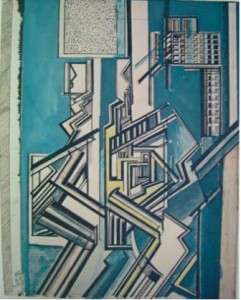
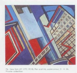
‘In inventing Vorticism, Lewis discovered a style that would do justice to his “Futurist” experience of living in the modern city’: Paul Edwards’s formulation is exact, as is Richard Cork’s remark that in New York (1914) Lewis ‘delineates the surging forms of twentieth-century urban civilization’.[36] The so-called ‘Vorticist Sketchbook’ of 1914-15 contains images of complex but elusive urban forms which are clearly referential yet do not resemble any actually existing building. There are allusions to the Futurist architectural drawings of Antonio Sant’Elia, as Cork points out,[37] but Sant’Elia’s drawings show stable structures that he hoped could be built (http://web.mit.edu/kimt/www/mas110/paper1/images/nexus.jpg). Nothing in Lewis could be built; it is rather as if he is re-imagining structures yet to be conceived, and relies on Sant’Elia only for the repeated rectangles of windows, which become his main signifier of high buildings in ‘the city’. Abstract Composition III (1914-15) is a pencil and watercolour sketch, but its shifting planes and elusive sense of distance and space make it difficult for the viewer to settle upon a definite position in relation to it. The eight pinkish frames in the top right-hand quarter belong in the one plane, but the pink frame below is in a different one. The two ‘tyre-tracks’ at bottom centre lead the eye up into the left-hand part of the design, which is largely unrelated to the right-hand pink frames, yet somehow linked to it. To suggest that Lewis’s imagination is predictive, I have placed beside his image two photographs of a recent building, Henning Larsen’s Roland Levinsky Building at the University of Plymouth, which was completed in 2007.
1914-15. Estate of Mrs G.A. Wyndham Lewis. By permission.
(1914-15). Estate of Mrs G.A. Wyndham Lewis. By permission.
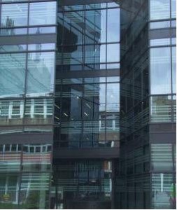
Henning Larsen with Building Design Partners, 2007.
Photo © Alan Munton 2010

Henning Larsen with Building Design Partners, 2007.
Photo © Alan Munton 2010.
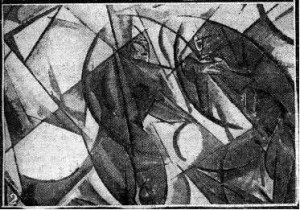
In Composition II (figure 3, and also from the Vorticist Sketchbook), figures at the top left seem to look down upon a empty, but thrilling because vertiginous, space between buildings. There is perhaps a form resembling themselves part-way down on the right. The city structures here are rigid and vertical, and the characteristic Vorticist diagonals are absent, except where human forms are implied. This is the cityscape in which the New Egos must learn to exist, overlapping with each other, intersecting with the environment and being repulsed by it, and ‘Siamese to any extent’. From here onwards, there can be no isolated human figures in art. In New York (1914; the title was probably Wadsworth’s)[38] the windows at the right dominate a perspective in which the point of view is upwards from street level, though that location is itself destabilised by a set of windows passing just overhead, at the bottom centre. Cork points out that the work in ink –- primarily the windows –- shows ‘feverish, often erratic scratchings of the pen’ (Cork, 341) as Lewis attempts to delineate this impossible urban world. Edwards points out a rare use of ‘modulated colour … suggesting light striking curved surfaces’ (Edwards 125), and this refers to the diagonal blue tube in the centre, another unbuilt and indeed unbuildable structure which is nevertheless, to our imaginations, a building that is part of an urban scene that is both oppressive and exhilarating. Again, this is the urban space that the New Ego must occupy.
Estate of Mrs G.A. Wyndham Lewis. By permission.
Finally, we reach the most important Vorticist work set in a cityscape. The Crowd is a very large oil painting that may derive from some of the motifs in the ‘Vorticist Sketchbook’.[39]
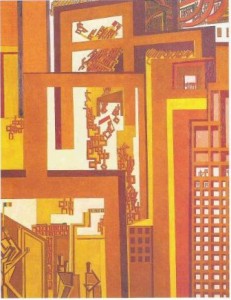
Estate of Mrs G.A. Wyndham Lewis. By permission.
The Crowd has the strong orange verticals of Composition II and the diagonal structure of Vorticism. The city is vertical and oppressive, and it is the revolutionary crowd which moves through it diagonally from bottom right to top left: the red flag which emerges in the upper centre –- and again near the top -– suggests a revolutionary intent. A strip of squares at lower right shows that the Sant’Elian window-rectangles -– so unstable in New York -– are now firm: they embody constraint. This constraint is both physical and political, and it is being broken by the revolutionary crowd. A French flag at bottom left hints at revolutionary forebears, whilst the letters ‘ENCLO’ signify the enclosed spaces out of which the crowd is breaking: they are perhaps moving towards a factory or wheeled (and therefore productive) structure at the top right. Everything in this picture contradicts the familiar view that Lewis was politically conservative, and everything in it confirms his place amongst the most intelligent, technically able, and conceptually advanced artists of his time. The Crowd is part of his engagement with the ‘marvellous enterprise’ of Picasso and Braque, and shows that he had indeed not failed to abate his interrogation of the possibilities that they had opened up. His interrogation is distinctive in the following ways. He goes beyond the local psychological effects of Sickert’s conversing couples; he conceives, in Design for Red Duet and elsewhere, encounters in which the human form internalizes the mechanical forms newly present in the environment, but nevertheless retains a version of the psychological relationship between couples found in some Camden Town pictures. In The Crowd, and the works that lead towards it, Lewis occupies not cramped rented rooms, but the public world of the streets. This is where the new ego can ‘venture forth [and] amplify itself’. He does not thereby abandon psychologically intense relationships, because in this world of revolution, and in the struggle for change, new selves and new kinds of relationships are being constructed on the streets beneath these modern buildings. It is here that people find welcoming ‘fraternal moulds for [the] spirit, and interstices of a human world’. These are the New Egos of Lewis’s imagination, and their presence in the City –- London, but much-altered –- ensures that Vorticism is not only a significant moment in the visual revolution of the twentieth century, but also a newly-confident moment of psychological transformation.
Endnotes
[1] Sylvester Bone, ‘Muirhead Bone and the Society of XII’, British Art Journal IV, 2 (Summer 2003), 67.
[2] British Medical Journal 11 July 1908, quoted by Colin Martin in ‘Artist reignites debate about BMA sculptures’, Student BMJ (2005), at http://www.bmj.com/cgi/content/extract/330/7485/259
[3] Wyndham Lewis, ‘Unlucky for Pringle’ in Unlucky for Pringle: Unpublished and other stories, eds C.J. Fox and Robert T. Chapman (London: Vision, 1973), p. 23.
[4] Eitan Karol and Finch Allibone, Charles Holden Architect 1875-1960, exh. cat. (London: Royal Institute of British Architects, 1988), p. 12.
[5] Now known as Architect with Green Tie and Anthony. See Wendy Baron, The Camden Town Group (London: Scolar Press, 1979), pp. 258-9 for an account.
[6] Wyndham Lewis, ‘The New Egos’, Blast 1 (1914), p. 141. All references to this page.
[7] Wyndham Lewis, ‘The Improvement of Life’, Blast 1 (1914), p. 146. The A.B.C. teashops were run by the Aerated Bread Company.
[8] Wendy Baron, ‘A cuckoo in the nest?’ in Robert Upstone (ed.), Modern Painters: The Camden Town Group (London: Tate Publishing, 2008), p. 46, p. 47. Hereafter Upstone. The exhibition ran at Tate Britain from 13 February to 4 May 2008.
[9] David Fraser Jenkins, ‘The response to Camden Town painting, then and now’, in Upstone, p. 48.
[10] Jenkins, p. 52, citing Rutter’s Some Contemporary Artists, of 1922.
[11] David Peters Corbett, ‘Modern themes in Camden Town Painting’, in Upstone, p. 34.
[12] Robert Upstone, ‘Sensation: The Camden Town Murder’, in Upstone, p. 131 and plates 65, 66, and 67. For a sceptical account of Sickert’s motives, see Waldemar Januszczac’s review of Walter Sickert: The Camden Town Nudes (Courtauld Gallery, 2007), TimesOnline 4 November 2007, at http://entertainment.timesonline.co.uk/tol/arts_and_entertainment/visual_arts/article2785444.ece
[13] Wyndham Lewis, ‘Vortex No. I: Art Vortex. Be Thyself’, Blast 2 (1915), p. 91.
[14] Paul Edwards, ‘“You Must Speak with Two Tongues”: Wyndham Lewis’s Vorticist Aesthetics and Literature’, in Blast: Vorticism 1914-1918, ed. Paul Edwards (Aldershot UK and Burlington VT: Ashgate, 2000), p. 118.
[15] Upstone, p. 117. From Upstone’s commentary on Gilman’s Mrs Mounter at the Breakfast Table.
[16] See the valuable study by Robyn Roslak, Neo-Impressionism and Anarchism in Fin-de-Siècle France: Painting, Politics and Landscape (Aldershot UK and Burlington VT: Ashgate, 2008). Hereafter Roslak.
[17] Wyndham Lewis, ‘Harold Gilman’, in Wyndham Lewis on Art: Collected Writings 1913-1956, eds Walter Michel and C. J. Fox (London: Thames and Hudson, 1969 [i.e. 1971]), p. 110. Hereafter WLOA. ‘Harold Gilman’ first published 1919.
[18] WLOA, p. 447. First published as ‘Round the London Art Galleries’, Listener XLIV, 1132, p. 508.
[19] Paul Smith, ‘“Parbleu”: Pissarro and the Political Colour of an Original Vision’, Art History 15, 2 (June 1992), p. 227.
[20] Ralph E. Shikes, ‘Pissarro’s political philosophy and his art’, in Christopher Lloyd (ed.) Studies on Camille Pissarro (London: Routledge and Kegan Paul, 1986), p. 36.
[21] Shikes, p. 53, and n. 29 for the date. ‘Je crois fermement que nos idées imprégnées de philosophie anarchique se déteingnent sur nos oeuvres’. Translation by present writer.
[22] Smith (note 19), p. 227.
[23] Roslak (note 16), p. 66.
[24] Smith, p. 231, and plate 52, p. 232. This is part of the discussion of Soi: see below.
[25] Smith, p. 235, and p. 245, n. 62; Roslak, p. 67.
[26] Anna Gruetzner Robins (ed.), Walter Sickert: The Complete Writings on Art (Oxford: Oxford University Press, 2000), p. 286. Hereafter Complete Writings on Art.
[27] Wyndham Lewis, letter to The New Age, 2 April 1914, in The Letters of Wyndham Lewis, ed. W.K. Rose (London: Methuen, 1963), pp. 58-59. I should like to acknowledge a helpful discussion with Paul Edwards on the significance of this letter, as on other matters.
[28] Baron (note 5), p. 67.
[29] David Fraser Jenkins, ‘The Response to Camden Town painting, then and now’, in Upstone, p. 52. This is close to Lewis’s view at the time, as his reply in The New Age to Sickert’s allegation of pornography shows (see note 27 above, and note 32 below).
[30] Sickert, Complete Writings on Art, pp. 382-3. Published in The New Age, 25 June 1914.
[31] Wyndham Lewis, ‘History of the Largest Independent Society in England’, in WLOA (see note 17), pp. 91-92.
[32] This ambition is presumably what Anna Gruetzner Robins refers to when she writes, with barely disguised irony, that Lewis and his associates, ‘could not tolerate Sickert’s idiosyncratic approach’ because they ‘thought that the business of being a modern artist had a lofty purpose’ (Gruetzner Robins 2000, p. xxxiii). Does she consider Sickert to have had a lowly purpose? She goes on to suggest that ‘the Lewis camp’ was responsible for ‘two cruel attacks’ on Sickert in The New Age, by someone signing himself ‘Arifiglio’ and ‘who almost certainly was Ezra Pound’, even though she admits that this ‘is not a pseudonym that Pound is known to have used’ (xxxiii, n. 20). Indeed it is not, nor is it identified as one in the most recent Pound biography by A.D. Moody (Oxford, 2007). Anybody with an ear for Pound’s prose style, or styles, would recognise that he was not the author of these attacks. Gruetzner Robins’s invention of a malicious ‘camp’, or conspiracy, determined to damage Sickert is untrue to the actual situation. ‘Arifiglio’, incidentally, is indexed under ‘Pastiche’, not under ‘Art’, in The New Age for 1914 and 1918. On 12 February 1914, p. 472, he (or she) published a pastiche of Tennyson’s ‘Maud’ entitled ‘Canzone Cubico’, directed at T.E. Hulme: ‘Come into the Garden, Hulme, / Jack Johnson [the boxer] is waiting for you … / He’ll arrange you in black and blue’. Since Hulme supported the new art, and belonged to Lewis’s supposed ‘camp’, Gruetzner Robins’s conspiracy becomes all the more unlikely. And Pound would not have written such verse.
[33] ‘The London Group’, WLOA, p. 87.
[34] Wyndham Lewis, Rude Assignment: An Intellectual Autobiography, ed. Toby Foshay (1950; Santa Barbara CA: Black Sparrow Press, 1984), p. 139.
[35] These arguments are also an implicit reply to Sickert’s particular interest in painterly technique.
[36] Paul Edwards, Wyndham Lewis: Painter and Writer (New Haven and London: Yale University Press,2000), p. 136: hereafter Edwards; Richard Cork, Vorticism and Abstract Art in the First Machine Age Volume 2: Synthesis and Decline (London: Gordon Fraser 1976), p. 341: hereafter Cork.
[37] Cork, p. 338, illustrates the apparent derivation of Lewis’s Composition V (1915-15) from Sant’Elia’s Architectural Dynamism of c.1913-14. The link is ‘too compelling to be ignored’ (p. 339).
[38] Cork, p. [559], n. 37. Lewis ‘may not have approved of this title’.
[39] Cork writes that in the ‘Sketchbook’ Lewis ‘was obviously working towards another major statement on canvas’, and that The Crowd was ‘the resultant picture’ (346). This is possible, but not certain. One owner, Dr Barnett Stross, named it Revolution (Cork, p. [559], n. 43).
To Cite This Article:
Alan Munton, ‘The Camden Town Group and London, Vorticism and the City’. Literary London: Interdisciplinary Studies in the Representation of London, Volume 8 Number 1 (March 2010). Online at http://www.literarylondon.org/london-journal/march2010/munton.html. Accessed on [date of access].